
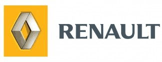
The revised logo (pictured) differs to the current branding with what Renault claims is a modern typography, as well as a darker shade of yellow for the background of the diamond.
The new design was chosen following a study carried out in various countries which showed the new typeface to be more readable and contemporary.
The new visual identity will be phased in progressively on all Renault communications as they become due for renewal, with the new branding already in evidence on the Paris Motor Show stand and in the UK on local and national press and TV advertisement campaigns for the new Renault Modus. The new image will be used across all other areas of the company’s business including dealer signage, publications, stationery and corporate websites. Prior to the launch of Renault’s most recent diamond logo in 1992, the company’s brand identity had only changed seven times since the company began in 1898. Neither the diamond on Renault’s car and LCV ranges, nor the company’s current strapline, Créateur d’Automobiles, which was introduced in 2000, are affected by the new development.


Login to comment
Comments
No comments have been made yet.